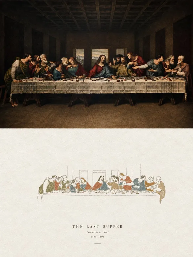
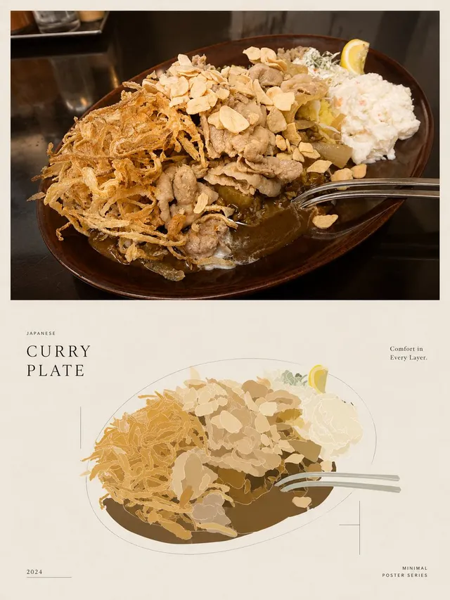
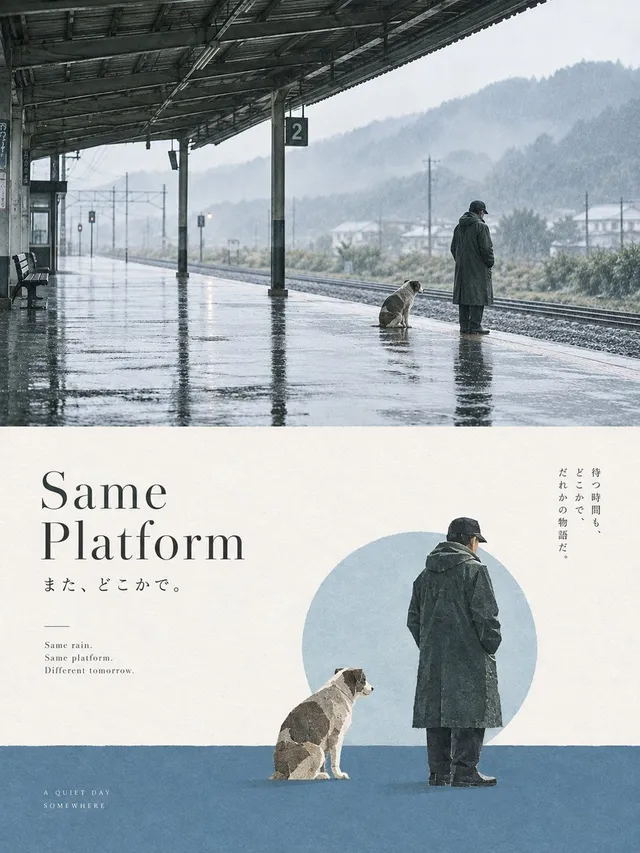
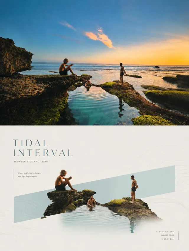
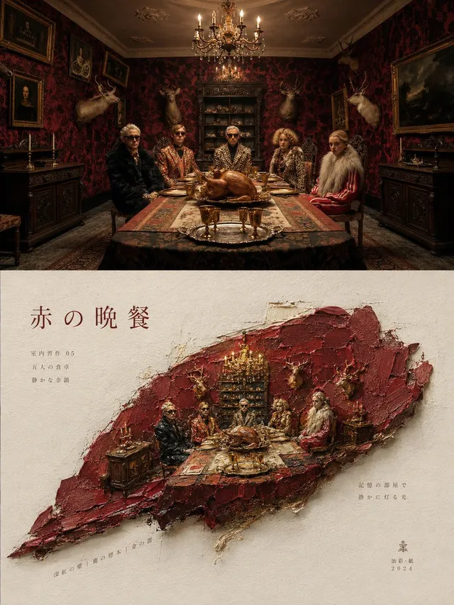
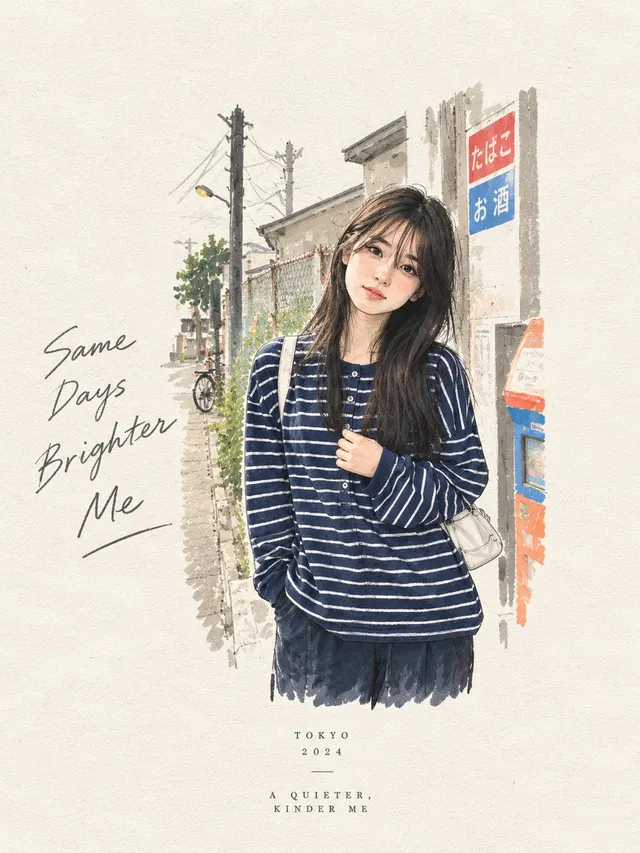
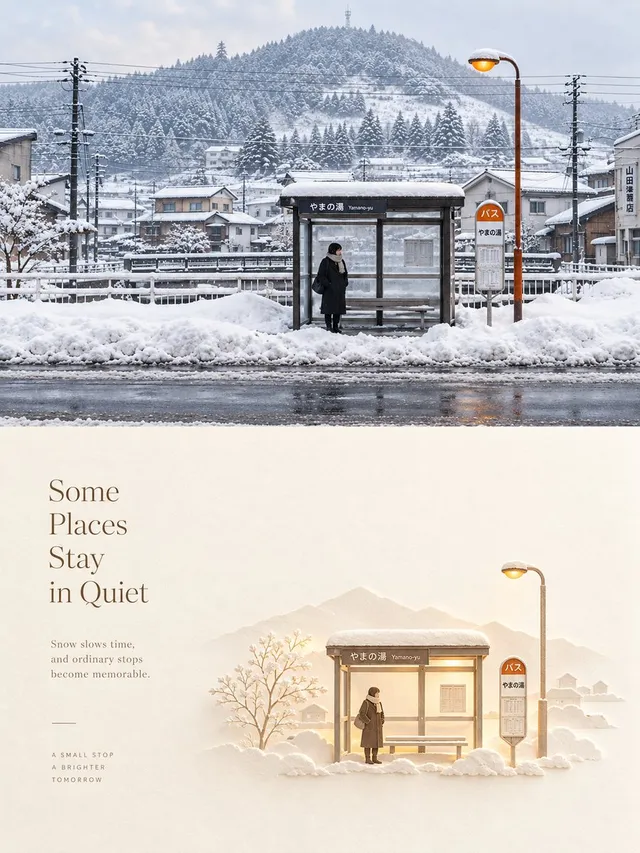
프롬프트/GPT Image 프롬프트/프롬프트 세부 정보이미지 프롬프트분할 화면 초현실 판화 디자인이미지 1/4업로드된 사진을 하이엔드 포스터로 변환하는 전문 다중 섹션 프롬프트로, 상단에는 원본 사진, 하단에는 미니멀한 초현실 판화 해석이 특징입니다.이 프롬프트는 참조 이미지와 함께 사용되었습니다이 프롬프트 사용좋아요688조회50,937북마크548이 프롬프트를 저장하거나 친구와 공유하세요.프롬프트 공유프롬프트복사Please turn {argument name="input" default="each photo I upload"} into a separate, high-end design poster. Do not create multi-image collages; output one standalone poster for each photo. Use an overall {argument name="aspect ratio" default="3:4"} vertical format, divided into two sections of strictly equal height, with the upper and lower halves each occupying exactly 50% of the composition. The upper half should retain the original photograph. Preserve the subject’s structure, authentic texture, natural lighting, and original color atmosphere. Apply only subtle, sophisticated photographic color grading to give it the visual quality of an art magazine, independent publication, or exhibition photograph. To adapt the image to the required aspect ratio, you may naturally extend the sky, ground, or surrounding environment, but do not stretch, distort, or alter the subject. The lower half should extract the most recognizable subject, silhouette, pose, and narrative relationship from the photograph and reinterpret them as a surreal, minimalist printmaking composition. Compress the subject into a clear, restrained visual anchor, usually rendered at a relatively small scale within a large field of negative space, preserving only the most essential silhouette and posture. Do not reproduce complex details. Instead, transform the original image’s movement, direction, light and shadow, or spatial relationships into a dynamic field that unfolds around the subject. For the dynamic field, naturally choose one primary motion logic based on the characteristics of the subject: it may fall from top to bottom, rise vertically, flow in a specific direction, radiate outward from a central point, or form irregular ripples and echoes. Use numerous fine lines, broken trajectories, rough halftone patterns, and variations in grain density to express movement. The field should be denser and more intense near the core, then gradually become sparser, more fragmented, and eventually disappear into the surrounding negative space. Avoid stacking multiple visual effects at once. Let one subject, one type of movement, and one vast spatial relationship define the composition. For the color palette, extract one {argument name="primary color" default="highly distinctive, energetic signature color"} from the photograph in the upper half, and combine it with warm white, ivory, or natural paper tones, plus a small amount of black, creating a strict 2–3 color palette. The primary color may be slightly purified and intensified so that it feels vivid and powerful without becoming overly digital. Create tonal variation through halftone density, layered ink coverage, and exposed paper rather than conventional gradients. Preserve the tactile qualities of screen printing, Risograph printing, coarse grain, paper fibers, uneven ink coverage, and slight registration misalignment. Avoid CGI, 3D effects, realistic digital lighting effects, and smooth digital illustratio프롬프트 보기