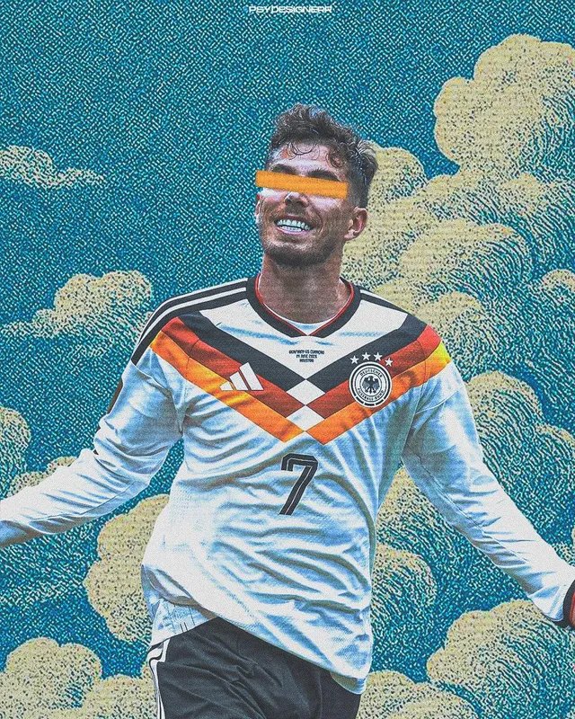
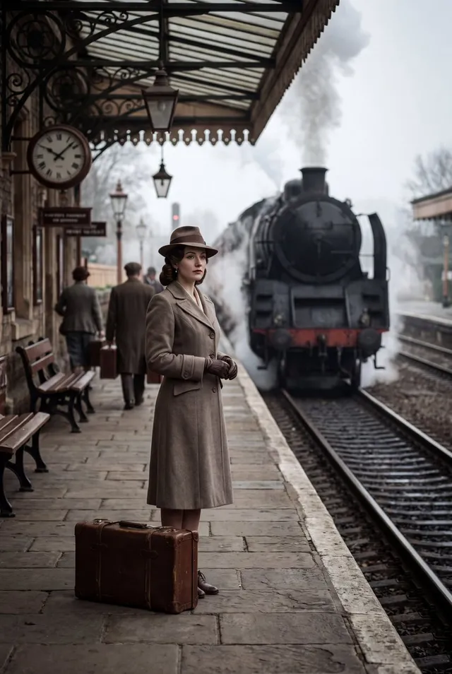
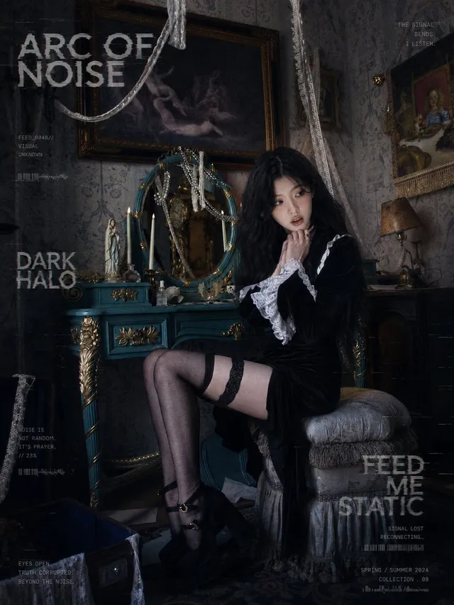
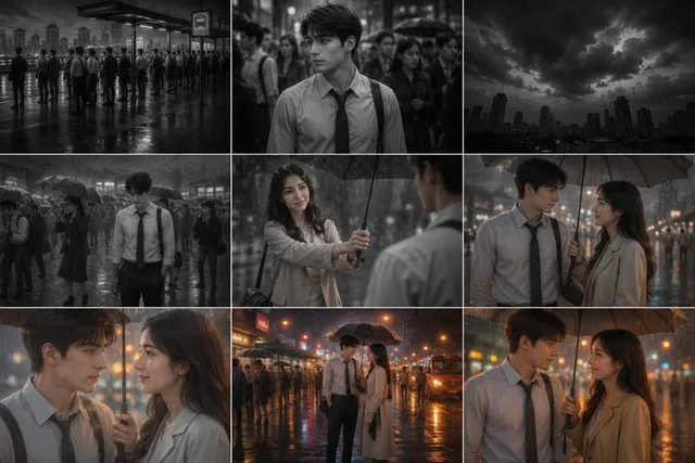
프롬프트/GPT Image 프롬프트/프롬프트 세부 정보이미지 프롬프트시네마틱 뮤직 페스티벌 포스터디스트레스 타이포그래피와 아티스트 비주얼을 위한 특정 레이아웃을 특징으로 하는 어둡고 시네마틱한 뮤직 페스티벌 포스터 디자인을 위한 포괄적인 프롬프트입니다.이 프롬프트는 참조 이미지와 함께 사용되었습니다이 프롬프트 사용좋아요120조회40,175북마크38이 프롬프트를 저장하거나 친구와 공유하세요.프롬프트 공유프롬프트복사Use the attached illustration as the main visual. Do not alter the character, face, or art style in any way. Create a vertical music festival poster (portrait, 2:3 ratio) with a dark, cinematic atmosphere. --- LAYOUT: - The illustration fills the full poster as background - The character's face must be clearly visible — keep the center of the image free from heavy overlays - Dark gradient overlay at the very top (behind title text only) and at the bottom (behind artist info only) - The middle zone where the face appears should remain mostly unobscured - The illustration should occupy as much of the poster as possible — minimize the text footprint - The illustration must bleed into the catchcopy zone — the image should remain visible and partially unobscured all the way down through {argument name="catchcopy end" default="[ここにキャッチコピー最終行]"} — only the very bottom (artist name and date line) needs a solid dark background - The bottom text block must be kept as small and tight as possible — prioritize illustration space over text size - All text in white --- TOP AREA: Title logotype — "天ROCKFEST2026": Ultra-bold slab or condensed gothic hybrid font, heavily distressed with uneven ink coverage, stamp-pressed texture, roughened edges as if screen-printed on a worn surface — think overinked woodblock print meets industrial stencil. Characters should feel physically heavy and slightly irregular, NOT clean digital type. The kanji "天" and Latin "ROCKFEST2026" must read as one unified logotype with consistent damage texture throughout. Color: solid white with ink-dropout gaps revealing the dark background beneath. Below the title logotype: Small spaced text (clean, thin): The Summer Camp Thin horizontal rule with small star or diamond ornaments at center Very small all-caps text: SUB HEADLINER --- BOTTOM AREA: The entire bottom text block must occupy no more than 18% of the total poster height — keep every text element as compact and tight as possible. The dark gradient at the bottom should begin only below {argument name="catchcopy line" default="[ここにキャッチコピー最終行]"} — the catchcopy lines sit directly over the illustration with only a very subtle dark veil, not a solid overlay. The solid dark background applies only to the artist name and date line at the very bottom. Line 1 — very small size, wide letter-spacing, distressed display font — worn ink texture and rough edges, consistent with the title logotype: {argument name="first catchcopy" default="[ここにキャッチコピー1行目]"} Line 2 — small Japanese mincho/serif, heavy weight, clean (no distress): {argument name="main catchcopy" default="[ここにキャッチコピーのメインフレーズ(最も印象的な一文)]"} [Generous vertical margin between Line 2 and Line 3] Line 3 — small size, wide letter-spacing, thin weight, clean: {argument name="final catchcopy" default="[ここにキャッチコピー最終行]"} Thin horizontal rule with small diamond ornament at center Line 4 — very small, wide letter-spacing: {argument name="artist name" default="[ここにアーティスト名(日本語)]"} Line 5 — very large display font, elegant tracking, distressed weight프롬프트 보기