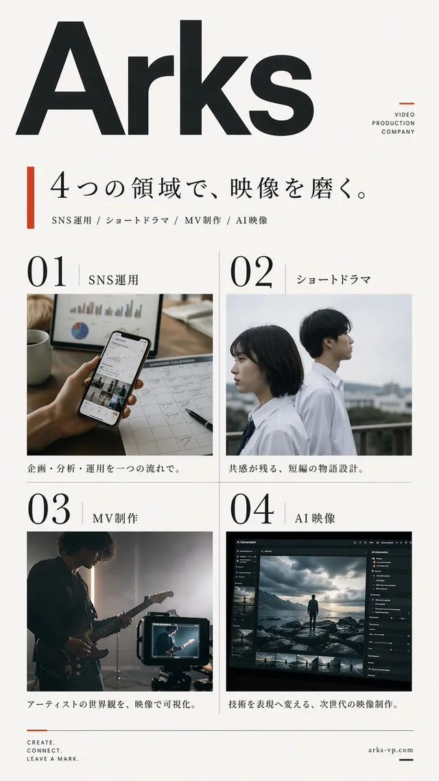
프롬프트/GPT Image 프롬프트/프롬프트 세부 정보이미지 프롬프트일본 디자인 잡지 포스터디자인 인텔리전스 서비스 또는 잡지 호를 홍보하기 위한 미니멀리스트 일본 에디토리얼 포스터 레이아웃입니다.이 프롬프트는 참조 이미지와 함께 사용되었습니다이 프롬프트 사용좋아요222조회34,897북마크234이 프롬프트를 저장하거나 친구와 공유하세요.프롬프트 공유프롬프트복사Create a clean editorial magazine poster for a Japanese design-intelligence service. Canvas: portrait poster on a light gray background, with a white page centered and a subtle drop shadow, about 4:5 ratio. Visual style: minimalist modern Swiss/Japanese editorial layout, lots of white space, sharp black typography, thin divider lines, small uppercase English microcopy, high-end design magazine feel. Main headline: large bold black Japanese type in the upper right, reading {argument name="headline text" default="デザインの Scopeを、もっと広げよう。"}, with “Scope” in Latin letters, arranged across 3 stacked lines and overlapping slightly above the photo area. Subheadline: smaller bold Japanese line below the headline, reading {argument name="subheadline text" default="水面下から、少し先の景色をのぞく。"}. Hero image: large rectangular photo occupying the lower center/right, showing {argument name="main subject" default="a Japanese businessman in a dark navy blazer and glasses standing in profile by a tall window, holding a small notebook or phone, looking out over a rainy modern city street with blurred buildings and traffic"}; cool blue-gray city tones, shallow depth of field, realistic photography. Left margin editorial column: at top left, small uppercase text “CURATED DESIGN INTELLIGENCE”, a thin vertical line beneath, then a small issue row with “01”, a long horizontal rule, and “ISSUE_05”. Along the lower left margin, create exactly 4 stacked navigation items with small labels and descriptions: 1) “PERSPECTIVE” with “Stream / culture, urban, and new synthifications.” and number “01”; 2) “AI & DESIGN” with “Designing conversational architectures and design-agent landscape.” and number “02”; 3) “CULTURE” with “Locomoting nation of Tokyo, extensionism, privileges.” and number “03”; 4) “RESEARCH” with “Research unitile evolution in art and design professions.” Use tiny black type with thin vertical separators between items. Bottom right call-to-action: a pale lime rectangle overlaying the lower-right corner of the photo/page, containing bold uppercase text {argument name="call to action" default="READ / LEARN / THINK / MAKE"} and a faint white downward triangle/arrow icon. Constraints: keep the composition simple and premium, use only black, white, gray, cool photo colors, and pale lime accent; no logos, no extra text, no decorative clutter.프롬프트 보기