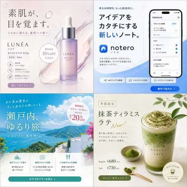
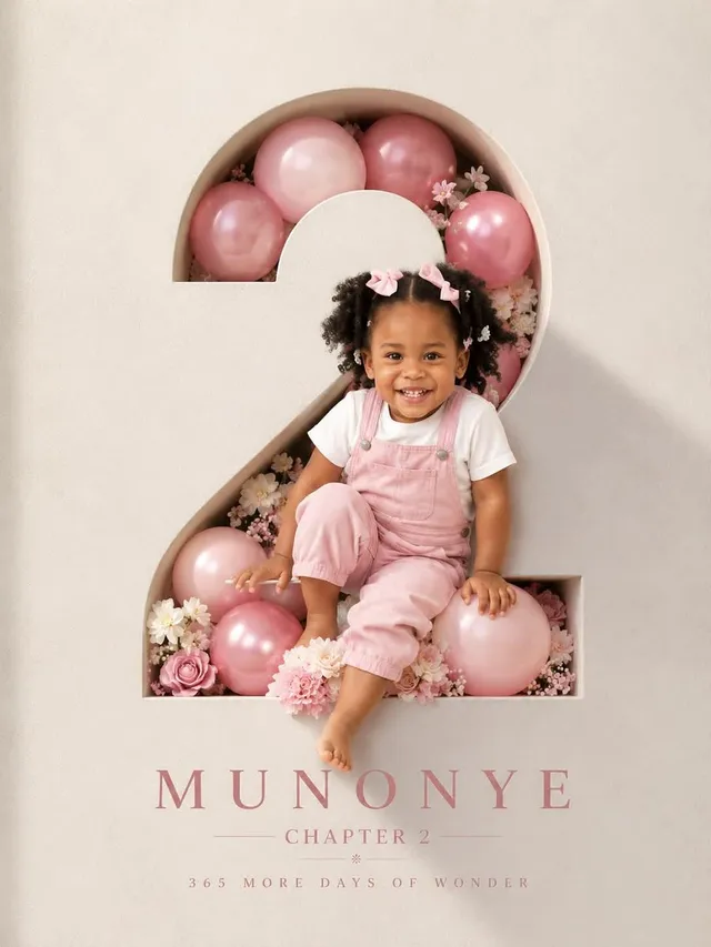
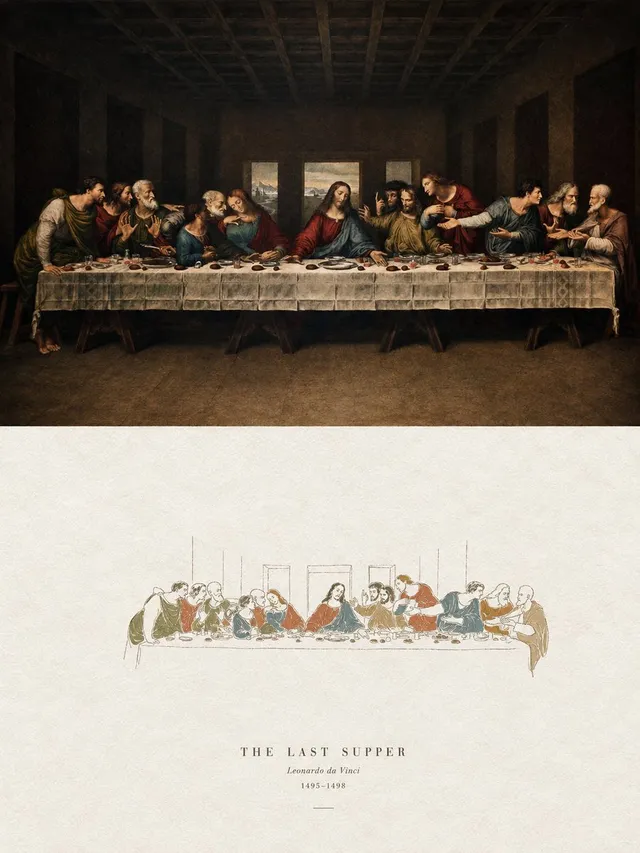
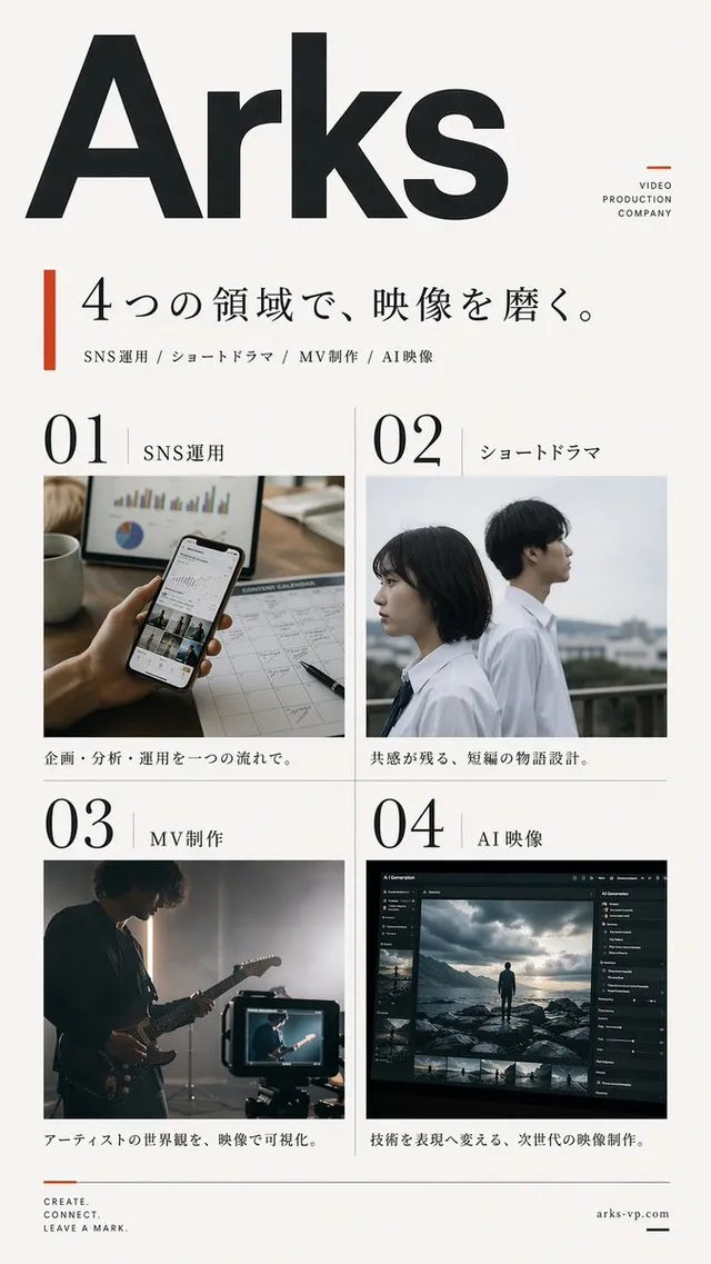
提示詞/GPT Image 提示詞/提示詞詳細資料圖片提示詞日系設計雜誌海報一款極簡日系編輯海報版面,用於推廣設計情報服務或雜誌期號。此提示詞使用了參考圖片立即使用讚222瀏覽34,897收藏234儲存此提示詞或分享給朋友。分享提示詞提示詞複製Create a clean editorial magazine poster for a Japanese design-intelligence service. Canvas: portrait poster on a light gray background, with a white page centered and a subtle drop shadow, about 4:5 ratio. Visual style: minimalist modern Swiss/Japanese editorial layout, lots of white space, sharp black typography, thin divider lines, small uppercase English microcopy, high-end design magazine feel. Main headline: large bold black Japanese type in the upper right, reading {argument name="headline text" default="デザインの Scopeを、もっと広げよう。"}, with “Scope” in Latin letters, arranged across 3 stacked lines and overlapping slightly above the photo area. Subheadline: smaller bold Japanese line below the headline, reading {argument name="subheadline text" default="水面下から、少し先の景色をのぞく。"}. Hero image: large rectangular photo occupying the lower center/right, showing {argument name="main subject" default="a Japanese businessman in a dark navy blazer and glasses standing in profile by a tall window, holding a small notebook or phone, looking out over a rainy modern city street with blurred buildings and traffic"}; cool blue-gray city tones, shallow depth of field, realistic photography. Left margin editorial column: at top left, small uppercase text “CURATED DESIGN INTELLIGENCE”, a thin vertical line beneath, then a small issue row with “01”, a long horizontal rule, and “ISSUE_05”. Along the lower left margin, create exactly 4 stacked navigation items with small labels and descriptions: 1) “PERSPECTIVE” with “Stream / culture, urban, and new synthifications.” and number “01”; 2) “AI & DESIGN” with “Designing conversational architectures and design-agent landscape.” and number “02”; 3) “CULTURE” with “Locomoting nation of Tokyo, extensionism, privileges.” and number “03”; 4) “RESEARCH” with “Research unitile evolution in art and design professions.” Use tiny black type with thin vertical separators between items. Bottom right call-to-action: a pale lime rectangle overlaying the lower-right corner of the photo/page, containing bold uppercase text {argument name="call to action" default="READ / LEARN / THINK / MAKE"} and a faint white downward triangle/arrow icon. Constraints: keep the composition simple and premium, use only black, white, gray, cool photo colors, and pale lime accent; no logos, no extra text, no decorative clutter.展開提示詞更多其他提示詞四款日式廣告橫幅概念@kgsi3D 奢華生日海報@Taaruk_壓克力手繪風格海報設計@xiaoxiaodong01日系影片製作海報@kantamizutamari超現實時尚品牌海報@rovvmut_幾何情感視窗海報@xiaoxiaodong01Kia Sportage三聯廣告@AmirMushichA/B 測試橫幅變化版@shupeiman探索更多分類用途更多社群媒體配圖海報/傳單產品行銷漫畫/分鏡頭像/個人形象更多風格更多攝影插畫電影劇照日系動漫極簡更多主題更多角色人像/自拍文字/排版網紅/模特建築/室內更多