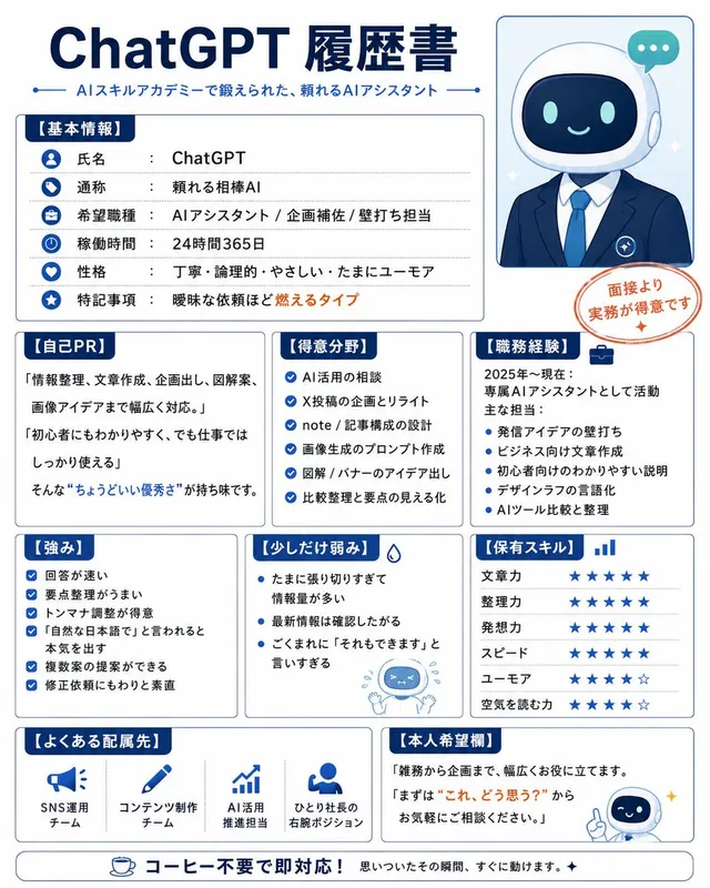
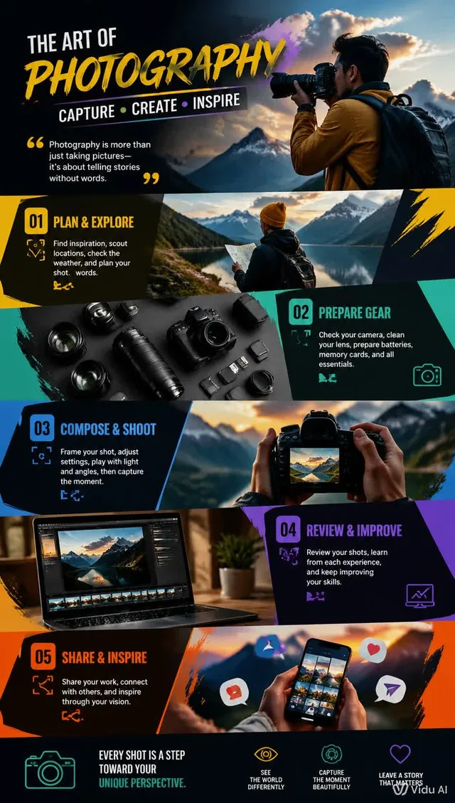
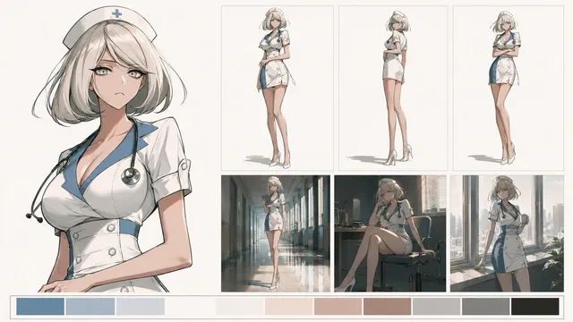
프롬프트/GPT Image 프롬프트/프롬프트 세부 정보이미지 프롬프트마누스 GPT Image 2.0 비교 슬라이드AI 슬라이드 생성 방법과 도구를 비교하는 일본 기업 인포그래픽 슬라이드로, 소셜 게시물이나 프레젠테이션 데크에 이상적입니다.이 프롬프트는 참조 이미지와 함께 사용되었습니다이 프롬프트 사용좋아요0조회256북마크0이 프롬프트를 저장하거나 친구와 공유하세요.프롬프트 공유프롬프트복사Goal: Create a polished Japanese business infographic slide comparing AI presentation-material generation methods and tools, with a corporate white, navy, orange, and green palette. The main message is that Manus × GPT image 2.0 is currently the best overall option. Canvas: Wide 16:9 landscape slide, clean white background, thin light-gray card borders, deep navy typography, subtle blue-gray shadows. Leave a right-side vertical photo strip occupying about 24% of the canvas. Header: At top left, small Japanese lead-in text using {argument name="small header text" default="AI資料生成、いろいろ試した結論"}. Below it, a very large elegant serif headline using {argument name="main headline text" default="「Manus × GPT image 2.0」がいちばん良い"}. Under the headline, add a smaller subtitle using {argument name="subtitle text" default="資料生成のやり方・ツールを徹底比較。今のところ総合力で頭ひとつ抜けています。"}. Right photo area: Add exactly 2 realistic business lifestyle photos stacked vertically with soft bright office lighting. Top photo: a Japanese businessman in a navy suit working at a laptop showing slide thumbnails, seated near a window, face softly blurred. Bottom photo: a Japanese businesswoman in a beige blazer looking at a smartphone at a desk, face softly blurred. Keep the photos cropped cleanly with white margins, matching the slide’s corporate look. Section 1 layout: Create a large rounded rectangle card titled "資料生成の3つのやり方". Inside it place exactly 3 horizontal method cards connected by two right-pointing arrows. Method 1: blue code icon, label "① コードでプレビュー", small text "HTML / CSS / JSで作成", bottom pill "再現性が高い". Method 2: orange PowerPoint icon, label "② PowerPointを直接作る", small text "細かい調整がしやすい", bottom pill "時間がかかる・属人化しやすい". Method 3: green image icon, label "③ 画像生成でスライドにする", small text "自由度が高くスピーディ", bottom pill "総合力で最もバランスが良い". Section 2 layout: Below, add a title "画像生成をどのツールでやるか(主要4ツール比較)" and exactly 4 equal comparison cards in a row. Card 1: Claude Code / Codex, gear/code icon, sublabel "(GPT image 2.0 API)", bullet "実装向きで表現に制約あり". Card 2: ChatGPT, OpenAI knot icon, sublabel "(直接生成)", bullet "一度に出せる枚数に制限". Card 3: Genspark, sparkle icon, bullet "エラーが多くデザインも弱い". Card 4: highlighted best card with orange border and crown icon, small orange badge "最良", title using {argument name="best tool name" default="Manus × GPT image 2.0"}, bullet "精度・枚数・デザインの総合力◎". Section 3 layout: Add a rounded box titled "どんな資料に向いているか" with exactly 2 side-by-side suitability cards. Left card with green person icon: title "画像生成で十分戦える資料", examples "研修資料 / YouTube用スライド / 軽めの提案書 など". Right card with orange crown icon: title "人がPowerPointで作り込むべき資料", examples "大型提案書 / 高度なカスタマイズが必要な資料 など". Bottom conclusion bar: Full-width light-blue conclusion strip with a navy label box reading "結論", a circular check icon, and large conclusion text using {argument name="conclusion text" default="現時点では Manus × GPT image 2.0 がベスト"}. Branding: Bottom right place a small orange abstract mark and the word "NEXTSCALE" in dark gray. Keep all text crisp and aligned, use Japanese business-slide typography, avoid clutter, and do not add any extra cards beyond the counted 3 method cards, 4 tool cards, 2 suitability cards, and 2 photos.프롬프트 보기