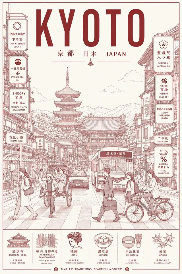
프롬프트/GPT Image 프롬프트/프롬프트 세부 정보이미지 프롬프트미니멀리스트 도쿄 도시 라인 아트 포스터이미지 1/2도시 리듬과 스위스 국제 스타일 디자인을 강조하는 도쿄 도시 포스터를 위한 세련된 모노라인 건축 일러스트레이션 프롬프트입니다.이 프롬프트 사용좋아요72조회2,357북마크33이 프롬프트를 저장하거나 친구와 공유하세요.프롬프트 공유프롬프트복사Create an ultra-premium minimalist city portrait poster of {argument name="city" default="TOKYO"}, capturing the quiet sophistication and organized chaos of everyday urban life through an architectural line-art illustration. Instead of highlighting famous landmarks, portray a lived-in neighborhood scene where daily routines define the city’s identity. Feature a dense yet elegant streetscape inspired by areas such as Shimokitazawa, Nakameguro, Kichijoji, Koenji, or a contemporary Tokyo side street filled with local character. SCENE The composition centers on a bustling pedestrian corridor lined with compact cafés, ramen counters, bookstores, convenience stores, bicycle parking, vending machines, rail infrastructure, utility poles, narrow storefronts, and layered Japanese signage. Residents naturally inhabit the scene: Office workers commuting Students crossing intersections Cyclists weaving through streets Café patrons sitting outdoors Shoppers carrying bags Locals waiting at crossings or transit stops The atmosphere should feel authentically Tokyo—efficient, stylish, human-scaled, and deeply urban. Large landmark structures may appear only as distant silhouettes integrated into the skyline, never as focal points. VISUAL STYLE Contemporary editorial illustration Precision architectural drawing Minimalist monoline artwork Swiss International Style poster design Japanese graphic design influence Museum-quality city branding aesthetic Clean vector rendering Geometric perspective construction Strong use of negative space Sophisticated visual hierarchy LINEWORK Extremely fine monoline strokes Technical illustration precision No sketchiness Dense urban detailing Organized rhythm of windows, cables, signs, bicycles, storefronts, railings, and street furniture Intricate composition that remains visually calm and readable COLOR CONCEPT Use a restrained two-color silkscreen system: One carefully selected ink color One contrasting paper/background color Choose colors that evoke Tokyo’s refined urban energy and contemporary design culture. Suggested palette: Deep {argument name="ink color" default="vermilion"} ink on warm {argument name="paper color" default="rice-paper ivory"} stock Avoid gradients, neon effects, multiple accent colors, or photographic lighting. TYPOGRAPHY Top: {argument name="english title" default="TOKYO"} Bottom: 東京 Typography should feel like a luxury design publication or cultural exhibition poster. Perfect kerning Clean editorial layout Modern sans-serif typography Authentic Japanese signage throughout the illustration No distorted or unreadable text MOOD Not a tourist destination. Not a postcard. A visual celebration of Tokyo’s everyday elegance, urban rhythm, design culture, and human-scale density. The poster should feel like it belongs in a contemporary art museum, premium travel journal, or international design exhibition. OUTPUT Vertical composition (4:5 or 2:3 ratio) Ultra-high-resolution 8K Print-ready poster design Crisp vector-qu프롬프트 보기