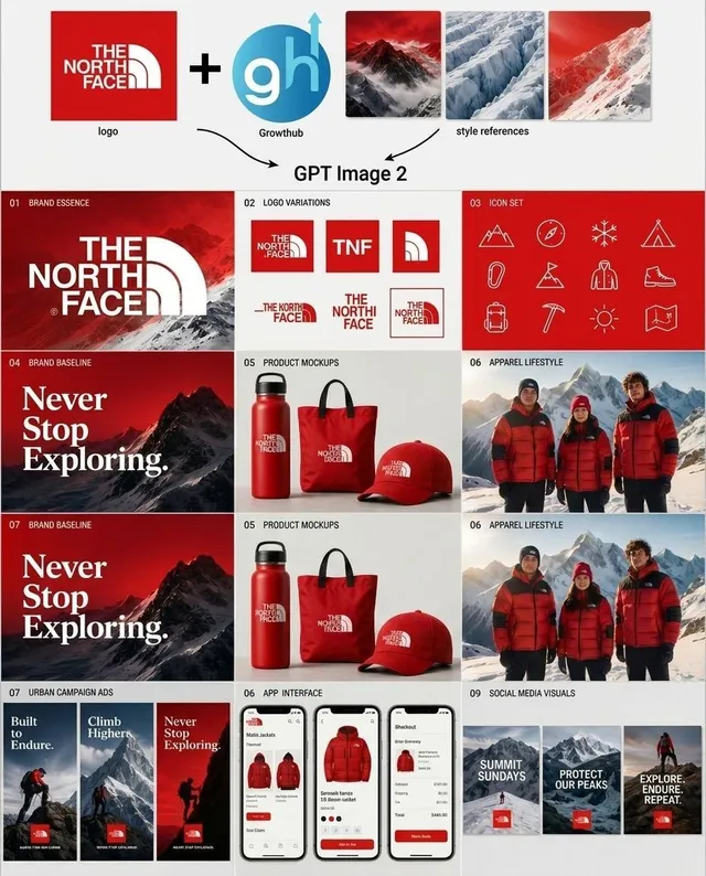
프롬프트/GPT Image 프롬프트/프롬프트 세부 정보이미지 프롬프트아웃도어 브랜드 키트 프레젠테이션 보드아웃도어 브랜드를 위한 로고 변형, 아이콘, 목업, 의류 이미지, 광고, 앱 화면 및 소셜 타일을 포함하는 정사각형 에이전시 스타일 브랜드 시스템 보드를 생성합니다.이 프롬프트는 참조 이미지와 함께 사용되었습니다이 프롬프트 사용좋아요5조회183북마크1이 프롬프트를 저장하거나 친구와 공유하세요.프롬프트 공유프롬프트복사Goal: Create a clean square brand-kit presentation board showing an AI-generated logo system and marketing variations for {argument name="brand name" default="The North Face"}, combining an uploaded logo, an AI tool logo, and mountain style references into a complete visual identity system. Canvas: Square 1:1 layout on a light gray/off-white background, designed like a polished agency case-study sheet. Use crisp grid lines, generous margins, and a modern editorial branding style. Top input row: Show exactly 5 input elements across the top: 1 red square brand logo tile for {argument name="brand name" default="The North Face"}; 1 large black plus sign; 1 circular blue logo marked “gh” with a small upward arrow and the label “Growthub”; and 3 vertical mountain style-reference thumbnails in red, blue-white glacier, and red snowy mountain palettes. Add small captions under the logo and style references. Beneath this row, draw two curved black arrows pointing down toward the centered text “GPT Image 2”. Main layout: Below the header, create a 3-column by 4-row grid of exactly 12 brand-kit panels, each with a tiny numbered label in the upper-left corner and a bold section title. The overall palette is red, white, black, ice blue, and mountain gray, with premium outdoor expedition energy. Panel count and content: 1. “01 Brand Essence”: large red poster-style panel with a snowy mountain background and oversized white {argument name="brand name" default="The North Face"} logo lockup. 2. “02 Logo Variations”: white panel showing exactly 6 logo variations: full red-square logo, red square with “TNF”, red square with arch symbol only, horizontal wordmark with arch, stacked wordmark, and small boxed lockup. 3. “03 Icon Set”: red panel with exactly 12 thin white line icons arranged in a 4-by-3 grid: mountain, compass, snowflake, tent, carabiner, flag, parka jacket, hiking boot, backpack, ice axe, sun, and folded map. 4. “04 Brand Baseline”: dark red mountain poster with large serif white slogan text “Never Stop Exploring.” 5. “05 Product Mockups”: white product mockup panel with exactly 3 red branded items: water bottle, tote bag, and baseball cap. 6. “06 Apparel Lifestyle”: photorealistic outdoor apparel scene with exactly 3 people wearing red and black expedition jackets in snowy mountains. 7. “07 Brand Baseline”: repeat the dark red mountain slogan poster, again reading “Never Stop Exploring.” 8. “05 Product Mockups”: repeat the same white panel with exactly 3 red branded products: bottle, tote, and cap. 9. “06 Apparel Lifestyle”: repeat the same snowy mountain lifestyle panel with exactly 3 red-jacketed people. 10. “07 Urban Campaign Ads”: show exactly 3 tall vertical ad posters with mountain climbers and red logo blocks, titled “Built to Endure.”, “Climb Higher.”, and “Never Stop Exploring.” 11. “08 App Interface”: show exactly 3 smartphone screens for an outdoor shopping app, featuring red jackets, product cards, checkout UI, red buttons, and clean white mobile interface design. 12. “09 Social Media Visuals”: show exactly 3 square social media tiles with snowy mountain backgrounds, red logo blocks, and white text: “SUMMIT SUNDAYS”, “PROTECT OUR PEAKS”, and “EXPLORE. ENDURE. REPEAT.” Visual style: Mix photorealistic mountain photography with crisp vector logo work, minimal product mockups, thin white iconography, and luxury outdoor-brand art direction. Use red gradient overlays, snow textures, high contrast typography, and neat case-study spacing. Keep the design readable at a glance, with no extra panels, no watermarks, and no unrelated text.프롬프트 보기