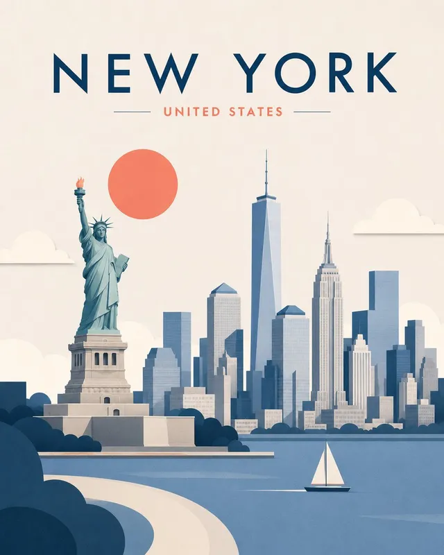
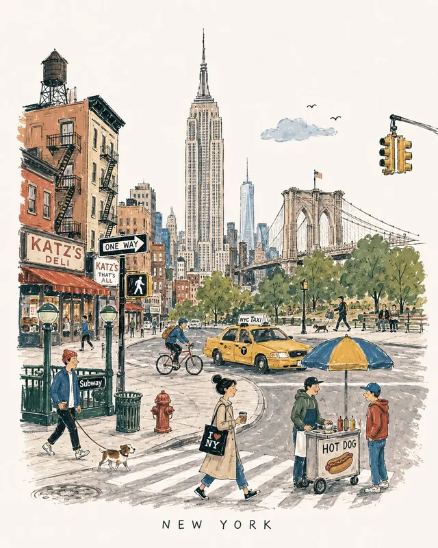
프롬프트/GPT Image 프롬프트/프롬프트 세부 정보이미지 프롬프트빈티지 여행 포스터 시리즈 생성기이미지 1/4엄격한 구성 및 레이아웃 규칙을 유지하면서 모든 도시의 일관되고 고품질의 빈티지 리노컷 여행 포스터를 생성하기 위한 상세한 시스템입니다.이 프롬프트 사용좋아요12조회702북마크17이 프롬프트를 저장하거나 친구와 공유하세요.프롬프트 공유프롬프트복사Create a premium 4:5 vertical vintage travel poster for {argument name="city" default="[CITY]"}, {argument name="country" default="[COUNTRY]"}. Follow the same visual structure, composition, proportions, and artistic treatment in every generation. The result must feel like part of one consistent collectible poster series. FIXED COMPOSITION Use a single unified street-level scene, not a collage. Place one dominant central architectural or cultural subject as the visual anchor, occupying approximately 50–60% of the central image area. Integrate 2–4 recognizable {argument name="city" default="[CITY]"} landmarks or architectural details naturally into the same environment, with clear foreground, middle-ground, and background depth. Never make landmarks appear as floating objects or separate illustrations. Add subtle authentic city-life elements around the main subject: characteristic transportation, streets, buildings, cafés, shops, signs, pedestrians, cyclists, local objects, food, trees, and surrounding landscape. Only include details that genuinely belong to {argument name="city" default="[CITY]"}. FIXED LAYOUT Keep generous negative space around the main subject. Maintain a strong visual hierarchy: CITY NAME → MAIN SUBJECT → SUPPORTING CITY DETAILS → SMALL SECONDARY TEXT. Do not change the overall placement or scale relationship between these elements between generations. FIXED MATERIAL & COLOR Use an aged warm-ivory paper background with visible fibers, subtle stains, faded areas, rough edges, and authentic printed-paper texture. Use only three dominant colors: warm ivory, charcoal/black, and one signature accent color associated with {argument name="city" default="[CITY]"}. The accent color must remain selective and never dominate the entire image. FIXED ART STYLE Handmade vintage linocut + screen-print travel poster. Bold carved shapes, strong silhouettes, limited-color printing, rough ink texture, distressed halftone grain, slight ink misregistration, imperfect hand-cut edges, subtle fading, expressive perspective, and sophisticated editorial composition. Keep the artwork intentionally tactile and slightly imperfect. TYPOGRAPHY Integrate {argument name="city" default="[CITY]"} as large, bold, hand-printed typography in a consistent prominent position. Add {argument name="city phrase" default="[SHORT CITY PHRASE]"} as smaller secondary text. Typography must look physically printed into the artwork—slightly distressed, imperfect, and naturally integrated. Keep the wording exactly as provided; do not invent additional text. CITY IDENTITY The composition must immediately communicate {argument name="city" default="[CITY]"} through its architecture, street atmosphere, transportation, objects, landscape, and cultural details—not merely through famous landmarks. Select details that naturally coexist in one believable scene. DO NOT Do not use photorealism, glossy 3D rendering, gradients, excessive colors, modern digital effects, random landmarks, floating objects, tourist-collage layouts, excessive text, or ultra-clean vector graphics. Do not change the established composition, palette, typography hierarchy, or artistic style. FINAL GOAL A bold, sophisticated, culturally authentic vintage c프롬프트 보기