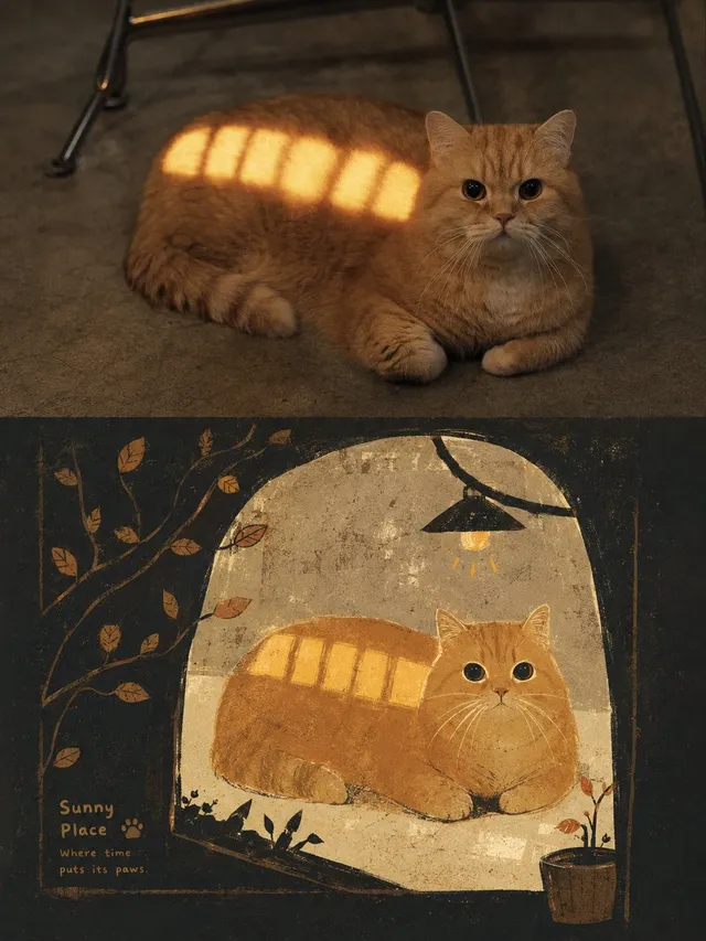
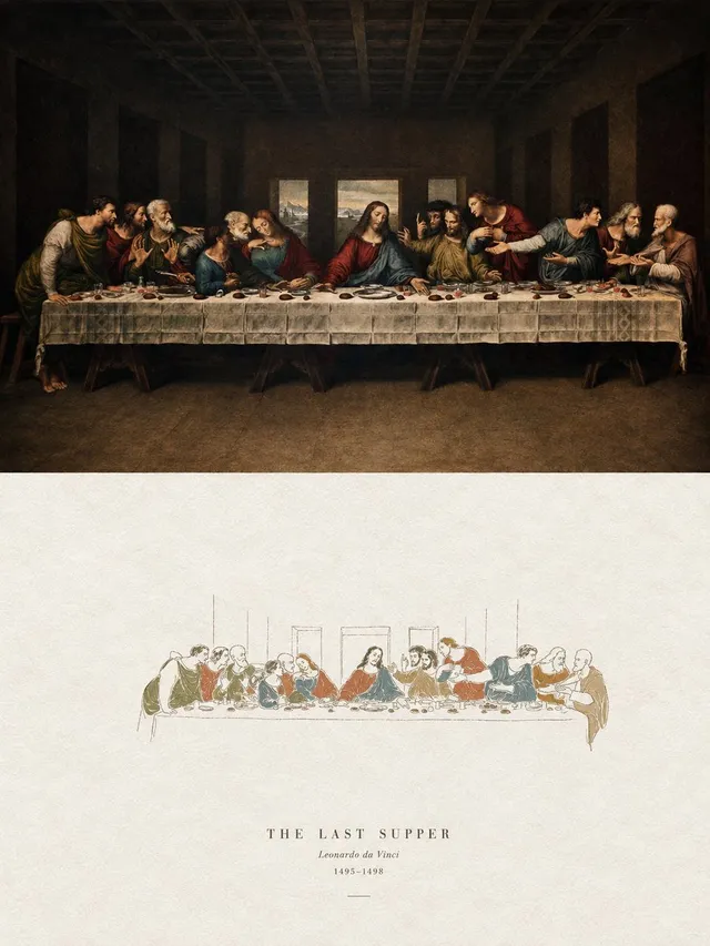
提示詞/GPT Image 提示詞/提示詞詳細資料圖片提示詞幾何分割海報設計第 1 張圖片,共 4 張一款高端海報提示詞,將畫布分割為上半部寫實照片與下半部幾何重構圖形,非常適合藝術出版品。此提示詞使用了參考圖片立即使用讚829瀏覽56,600收藏735儲存此提示詞或分享給朋友。分享提示詞提示詞複製Please turn each photo I upload into a separate premium-designed poster, with no multi-image collage; output each photo as an independent poster. Use an overall 3:4 vertical composition, strictly divided into two equal-height sections, with the upper and lower halves each occupying exactly 50% of the canvas. The upper half should preserve the original photograph, maintaining the subject’s structure, realistic texture, natural lighting and shadows, and original color atmosphere, with only subtle high-end photographic color grading to give it the quality of an art publication or exhibition photograph. To adapt the image to the required aspect ratio, you may naturally extend the sky, ground, or environmental background, but you must not stretch, distort, or alter the main subject. The lower half should extract the most recognizable subject, silhouette, posture, and narrative relationship from the photograph; first understand its core meaning, cultural attributes, or emotional relationship, then reconstruct it into a graphic composition combining the character of a folk-culture catalog, antique rubbing prints, and modern graphic design. Do not translate every element in the photograph one by one, and do not add generic traditional patterns; retain only one core visual motif and a very small number of auxiliary forms that truly carry narrative significance. Use silhouette, negative space, partial enlargement, shape merging, and symbolic transformation so that the graphic not only corresponds to the original object but also expresses the meaning behind it. Build the composition on a rigorous geometric framework and proportional system: derive circles, squares, triangles, arcs, axes, or repeated proportions from the structure of the subject itself as the “geometric matrix,” then align all main forms, secondary graphics, typography, and negative space through shared tangencies, common axes, nesting, mirroring, proportional progression, or edge cropping relationships. The layout may be freely distributed, off-center, extend beyond boundaries, or be asymmetrical, but every element must obey the same structural logic, creating a clear visual center of gravity, hierarchy, rhythm, and negative space; from a distance the order should be immediately legible, while closer viewing should reveal traditional print traces and subtle details. Avoid random scattered elements and decorative accumulation. Extract the most distinctive, lively, and spiritually expressive colors from the upper photograph and reorganize them into a clean, restrained paper-printing palette. Use a bright, light paper-colored background to create breathing room, one dark color to establish the visual skeleton, and one or two theme colors derived from the original photograph to organize the main subject and limited accents. Build depth through area ratios, overprinting, and ton展開提示詞