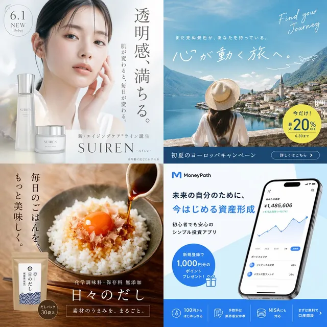
提示词/GPT Image 提示词/提示词详情图片提示词日本NEWT旅行App海报一张精致的方形日本旅行App广告,包含东京、旅行者、酒店和美食剪影、手机UI模型以及醒目的绿色NEWT品牌标识。这条提示词使用了参考图片立即使用点赞85浏览14,764收藏62保存这条提示词,或分享给朋友。分享提示词提示词复制Goal: Create a vibrant Japanese travel app advertisement for {argument name="brand name" default="NEWT"}, combining a Tokyo city travel collage with app promotion and optimistic vacation energy. Canvas: Square 1:1 poster, clean off-white background with bold emerald green brand color, high-resolution commercial advertising finish. Layout: Use a dynamic collage built from large organic wave-shaped cutouts. Top-left is dominated by a huge bold Japanese headline in bright green: {argument name="headline text" default="次の旅が、もう始まってる。"}. Beneath it, add smaller green Japanese subcopy: {argument name="subheadline text" default="航空券も、ホテルも、アプリひとつで軽やかに。"}. Top-right has small uppercase English text: “TRAVEL FEELS NEW.” with a tiny green airplane and dotted flight path. Main imagery: In the center, show a smiling young Japanese woman traveler in a crisp white blouse and green skirt, holding a smartphone and looking upward with excitement. Behind her, inside a sweeping cutout, show a bright aerial coastal Tokyo scene with blue ocean, skyline, and Tokyo Tower. On the right, include two rounded photo cutouts: exactly 1 luxury hotel room with a bed and city view, and exactly 1 close-up gourmet meal scene with sushi/seafood. Bottom-left includes exactly 1 airport scene with two young travelers walking with luggage under a departures sign. Bottom-center shows a silver rolling suitcase partially overlapping the main traveler. App and brand elements: On the lower-right, place a large tilted smartphone mockup displaying the NEWT travel booking app interface in green and white. The app screen should show a green header with the white bird logo and “NEWT,” a search bar, category icons, destination cards, hotel cards, and Japanese UI text. Next to it, add a white boarding-pass style ticket reading “NEXT DESTINATION” and “YOUR NEW JOURNEY AWAITS.” with a barcode and green bird icon. Bottom-left place a large green wave block containing a white simple bird/kiwi-like logo and the brand name {argument name="brand name" default="NEWT"} in bold white uppercase letters. Bottom-right add a rounded green call-to-action button reading {argument name="button text" default="NEWTで旅をみる"} with a white arrow. Counted visible elements: exactly 1 main woman traveler, exactly 2 travelers in the airport cutout, exactly 1 smartphone mockup, exactly 1 suitcase in the foreground, exactly 1 boarding-pass ticket, exactly 1 hotel-room photo, exactly 1 food photo, exactly 1 Tokyo aerial city photo, exactly 1 airport photo, exactly 2 white bird logos, exactly 1 tiny airplane icon, and exactly 1 location pin icon. Visual style: Bright modern Japanese startup advertising, glossy photo-collage realism mixed with clean vector graphics, rounded organic masks, fresh emerald green typography, airy white space, dotted travel routes, subtle contour-line patterns, optimistic summer daylight, crisp shadows, premium app-store campaign aesthetic. Constraints: Preserve the Japanese headline and CTA text clearly, keep all text legible, avoid clutter beyond the specified elements, no extra logos, no watermark, no social media UI.展开提示词